
MY ROLE : UX Researcher & UX Designer
TIMEFRAME: August, 2018 - November, 2018
CLASS: HCI Foundations
TEAM STYLE: 4 UX Researchers & UX Designers
TEAMMATES: Komal Hirani, Alana Pendleton, Rex McKay
TOOLS USED: Stakeholder Analysis, Benchmarking, Observational Studies, Interviews, Online Surveys, Optimal Workshop, Persona Generation, Storyboards, Journey Maps, User Testing, and Illustrator
BIGGEST TAKEAWAY: Don’t get distracted by the cute kittens! And also know when you expand past the scope limit.
Floofy | Purrfect Matchmaker
Objective
Over one semester: To radically improve the pet adoption experience
Over last few weeks of project: To radically improve the pet adoption experience for both adopters and shelters
Problem Space
Our goal for this project was to reduce the friction during the pet adoption process and design a meaningful experience for the potential adopter. We believed that upon successful completion of this goal, there would be a positive impact on adoption rates.
Initial Research
This project was near and dear to all of our hearts. We all had some experience of adopting a pet and knew connections to nearby shelters. To jump right in, we interviewed a few shelters and sent out a survey to gather information on the current adoption process and experience. Immediately we found an exhaustive list of concerns during the adoption process:
Compatibility with existing pet
Companionship for adopter and/or partner/kids
Compatibility with adopter and/or partner/kids
Time, space and cost associated with adopting pet
Meeting shelter or rescue group adoption requirements
Finding information and education on pet ownership
The pet’s personality, behavior and temperament
The pet’s history
The pet’s needs (responsibility required)
The pet’s breed (health implications)
The pet’s age
Forging a deep connection with pet
Companionship for existing pet
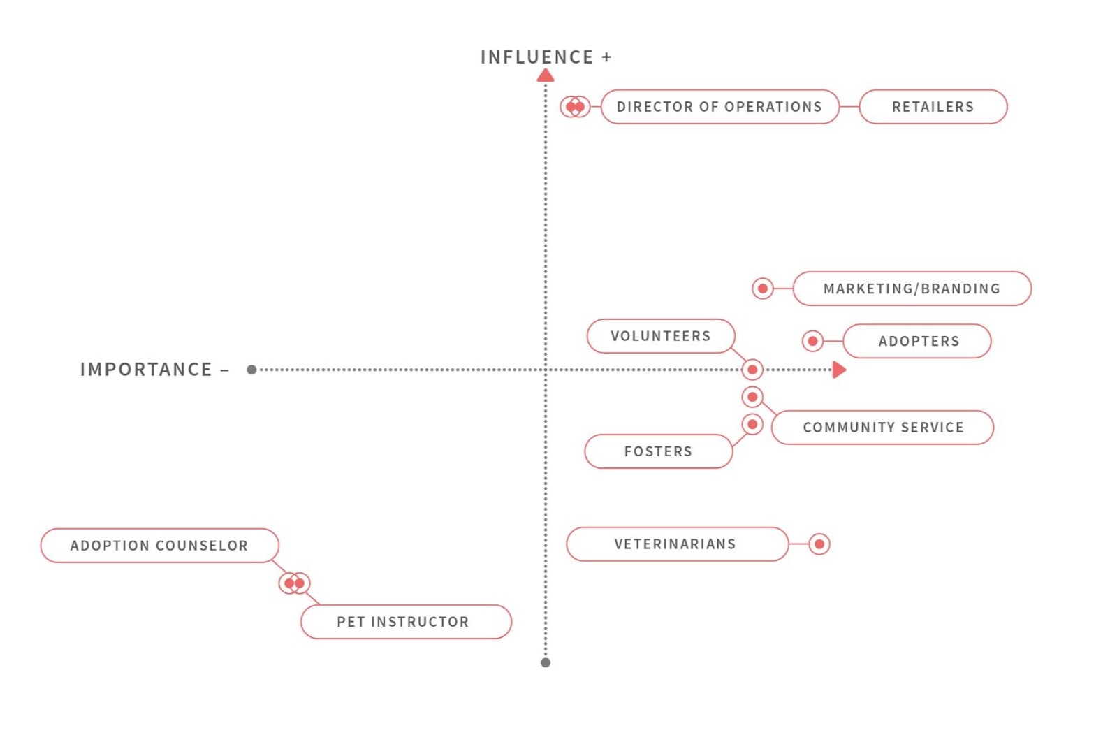
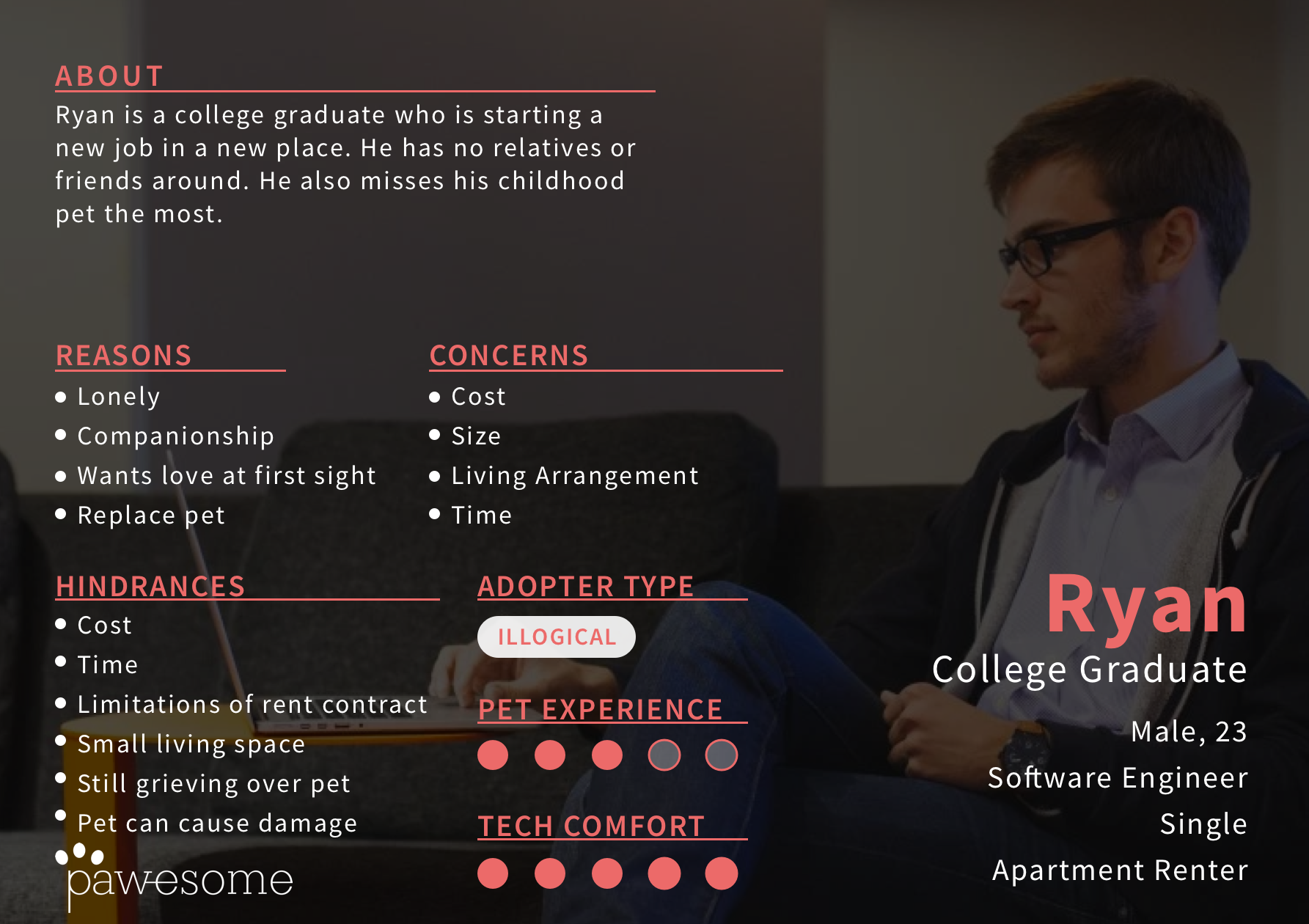
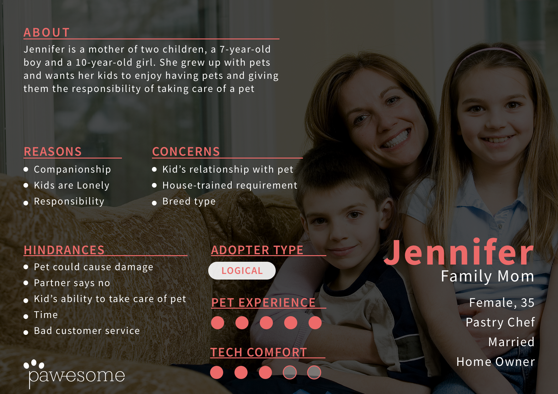
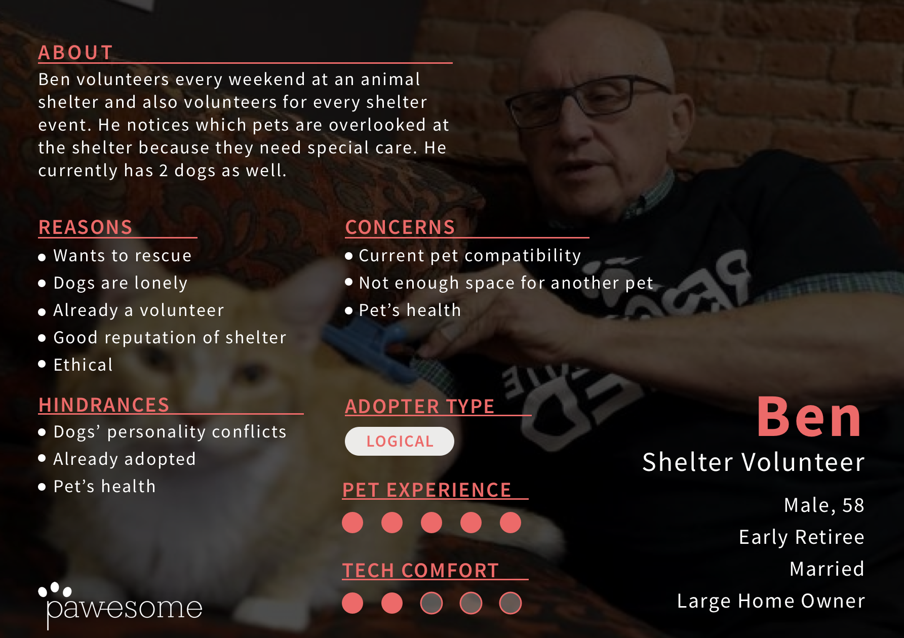
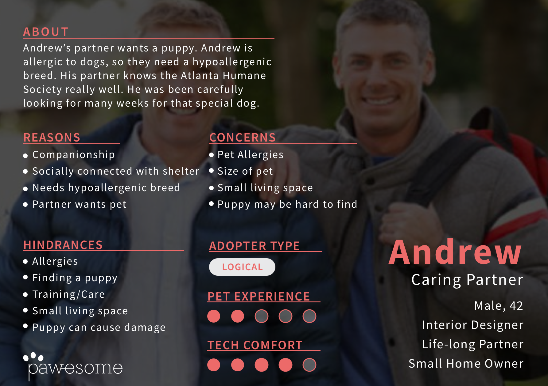
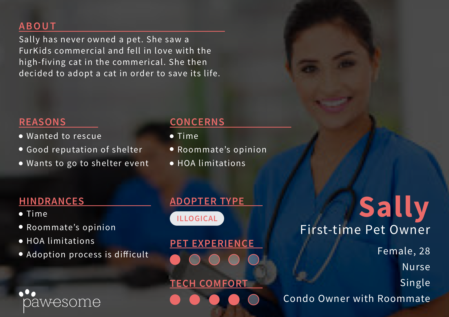
From our contextual inquiries, we were able to generate personas. Adoption offers a wide audience and we developed a diverse cast to keep in mind. Additionally, we created a stakeholder analysis, which would later prove extremely useful.
Ideation

The team walking through the different concepts
After gathering all the background information, each team member went and created multiple concepts. All of the generated concepts were brought together and organized by similarities. We then walked through and wrote key points about each direction, marking the ideas with the most potential. Doing so helped create 3 different directions to ponder: Pet Matcher Quiz, Pet Prep App, and AR Pet Shop.
PET MATCHER QUIZ
I worked on all of the storyboards. My style is simple but succinct!
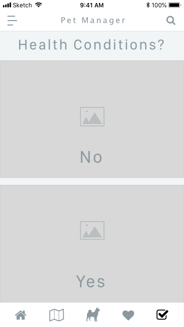
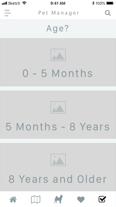
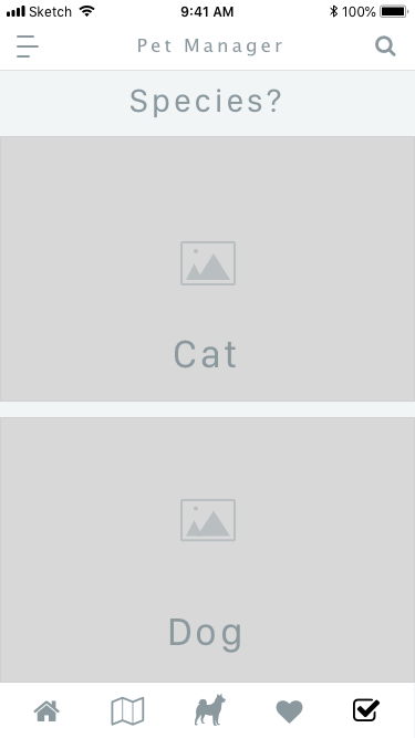
This concept derived from users’ confusion and uncertainty about how to find the correct pet. A strong point to utilize a survey is that is can mitigate breed bias and help users discover mixed breeds that are more common in shelters. Our solution would curate questions to be more clearly about the desired pet than how the owner would describe themselves. Many questions can also be created that could help users realize concerns or desires that they had not considered and better inform them for ownership. Another key goal would be to try to limit the number of animals that appear in a result. This would make results easier to parse as well as make the user feel a stronger sense of “destiny” with the select few that appear. This limitation could be achieved by reducing the available range of the search or by parsing the results down to specific shelters.
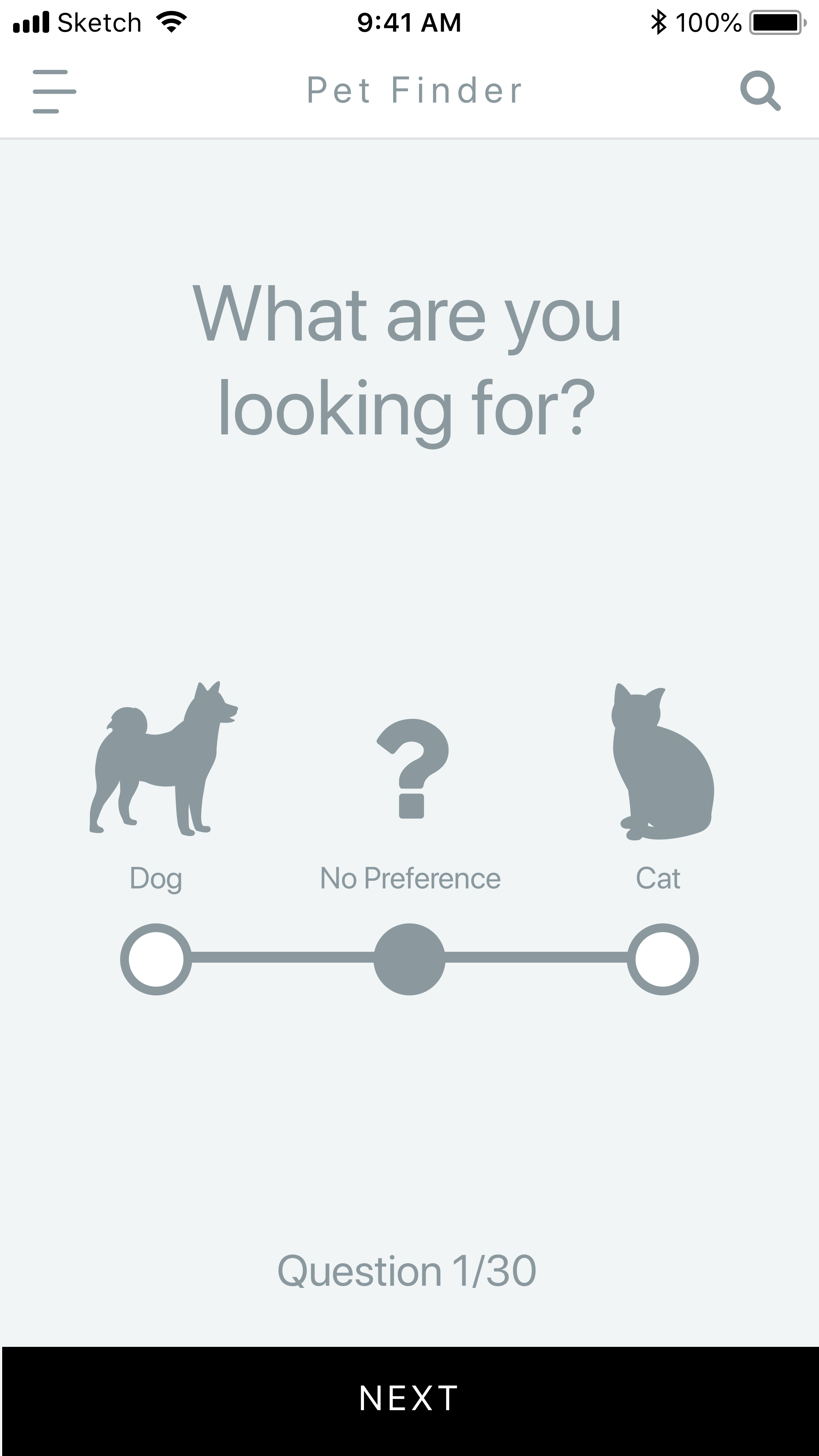
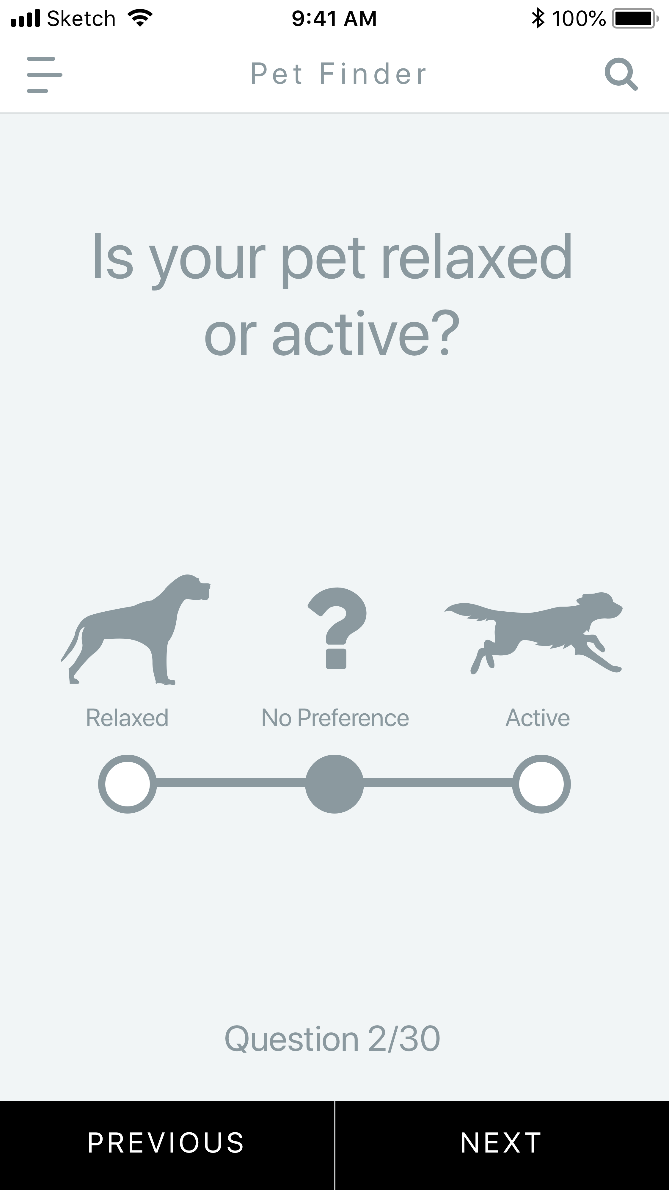
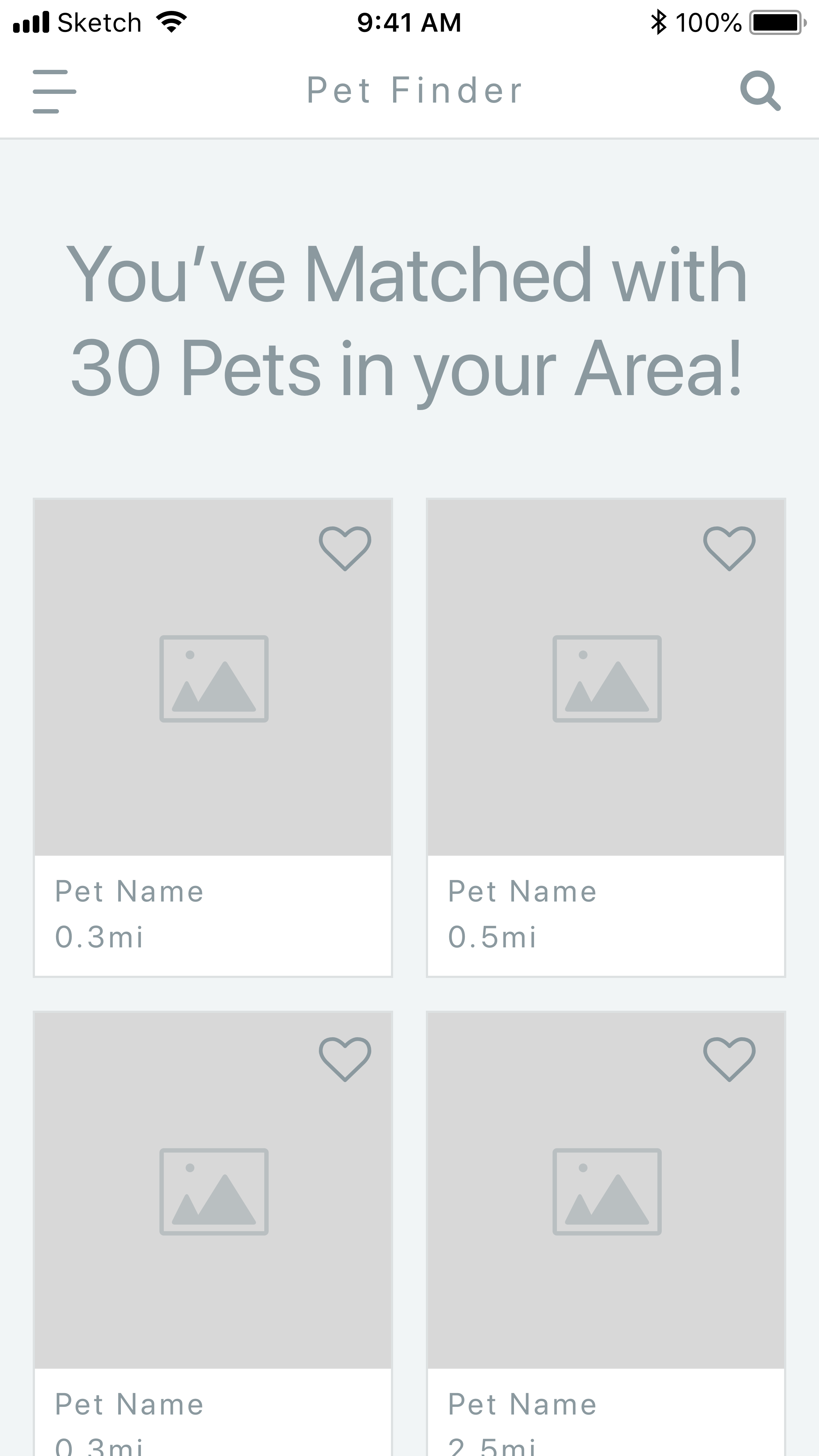
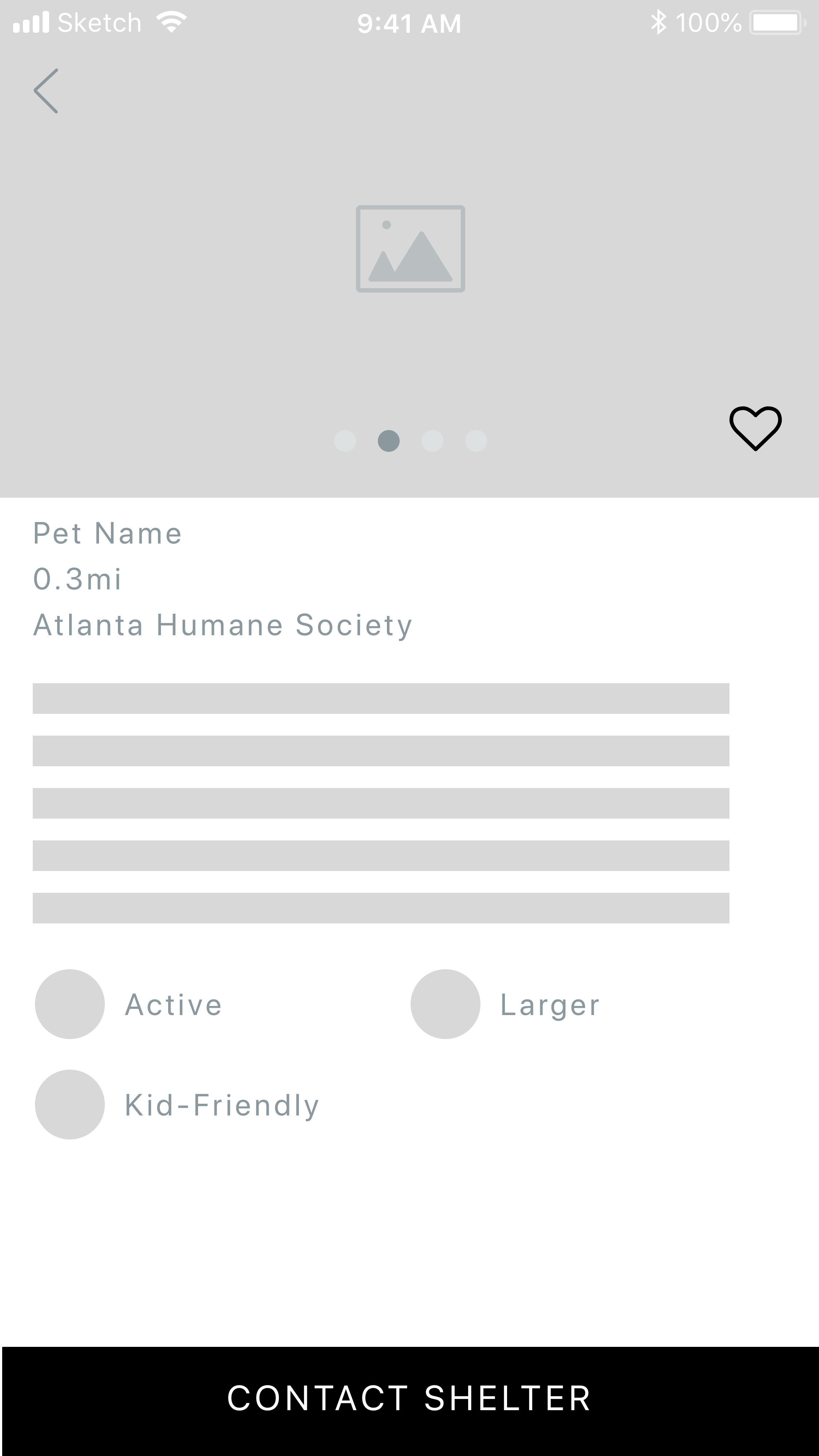
When a user sees their “winning” animals, they can expand their profile pages and quickly view a carousel of images to show their features and personality outside of a kennel. The page would also include a series of badges that describe the pet that directly relate to the answers selected by the user when they took their survey. They can have clear badges that indicate they are, “Kid-Friendly”, “Active”, “King/Queen of the Home”, etc. If a user is interested, the page would feature an easy to access call-to-action that can connect them with a shelter, rescue, or foster through email, phone, or address.
Strengths:
Provides the pet’s information entirely
The pet’s personality, behavior and temperament
The pet’s history
The pet’s needs (responsibility required)
The pet’s breed (health implications)
The pet’s age
Allows initial deep connection with the pet
Helps determine compatibility with the user and their household, including current pet(s)
Meets shelter or rescue group basic adoption requirements
Speeds up the process of finding the best matching pet
Weaknesses:
Does not reveal the time, space, or cost associated with
adopting a petDoes not inform nor prep user of general pet care
PET PREP APP
My favorite drawing is the little dog on the phone here. Imagine, AR dogs running around your house!
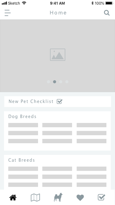
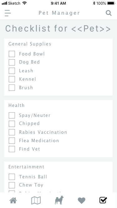
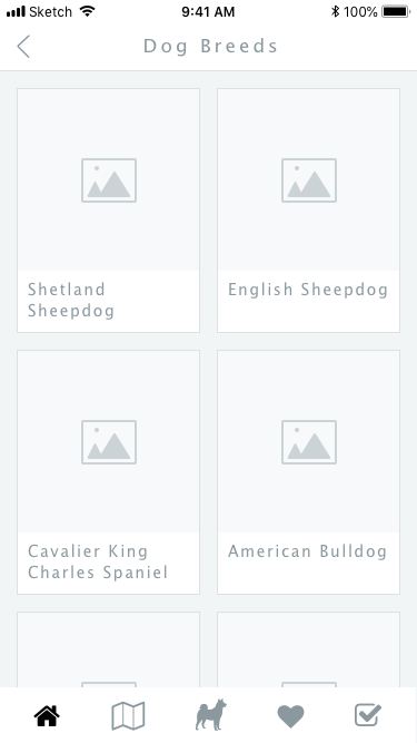
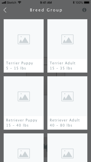
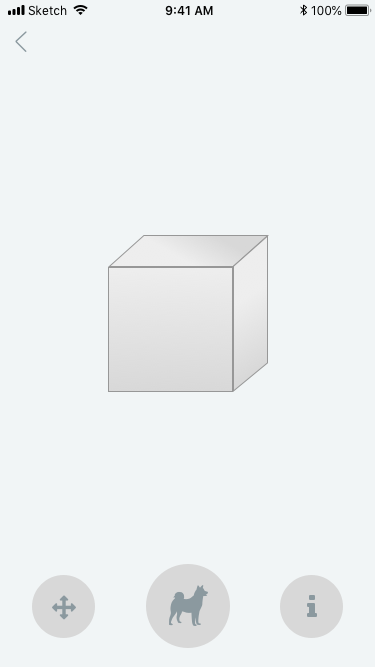
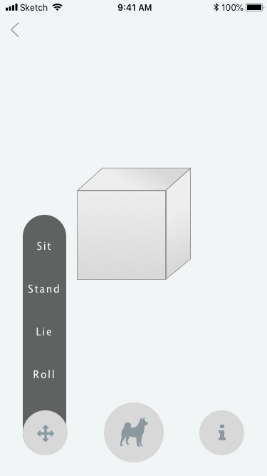
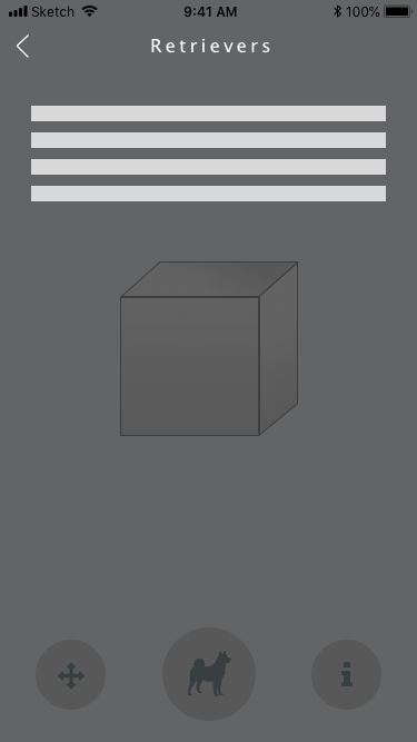
From our research, we saw a recurring theme of users expressing frustration with the actual adoption process. Many shelters and rescues require that potential adopters provide documentation for their housing, current pets, and finances. This caught adopters off-guard or added stress to the situation because of difficulty gathering some of the information. With a pet preparedness application, we can educate adopters on information they may need to have prepared so they are not blindsided. They can then use a checklist to track their tasks and use it to share their eligibility to shelters. This application also lends itself to educate adopters about pets before they commit to owning a pet. For first-time owners, they can use the app to learn about the different breeds of cats and dogs and have an idea of their general care, grooming, size, and temperaments. As an additional feature in this process, we wanted to include an AR sizing element that would help users understand the size of their pet and thus be able to conform to proper accommodation.
Strengths:
Informs user of the adoption process in its entirety
Prepares user for adoption process per the shelter they are adopting from
After adoption, better allows the user to keep up with pet information
Especially health care and appointments
By-product, de-stresses users
Before adoption, provides basic pet care information dependent on generalized breed groups
Better informs the user of the general type of pet they should get
Provides education on basic care for pets
Provides locations of nearest pet-related entities
Weaknesses:
Does not find out how compatible a pet might be with the user or the user’s current household members, including current pets
Does not reveal the potential pet and the connection between the user and pet
Does not provide pet’s history
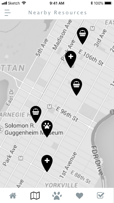
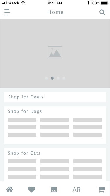
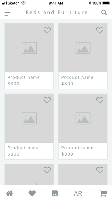
PET SHOP

Ah, the simple “time passes” classic blank scene.
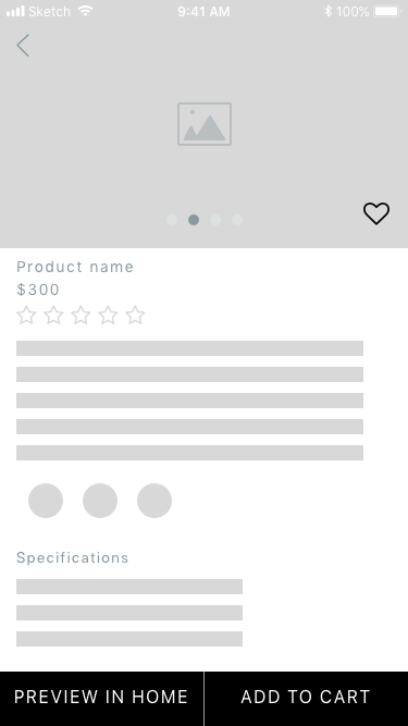
When considering a new animal, many people were concerned about how much space they and their supplies would take up or how to plan out their area in their home. This solution provides answers to these questions in the form of AR. To assist in this, users can use an app to search items for their pet. The differentiator is that users would be able to preview their dog bed in their home via AR. With the latest AR toolkits, we are able to have users scan a room in their house to create a grid for items to be deliberately placed. If a user finds that they like the item and have found a place to accommodate it, then they can add it to their cart for purchasing. For further use, they can select and arrange multiple items into a single AR scene. This would allow users to turn a blank room into their “dream” arrangement for their pet. This feature lends itself to gamification and turning into a fun task for the wistful. For those seeking the advice of friends, family, or partners, users can take a picture of their scene for referencing later.


Strengths:
Informs the user about supplies need for the pet care
Specifically the size, along with the typical details (like price)
Helps the user visualize all the necessary items needed to take care of a new pet
Helps build anticipation before a pet is chosen
Shows users the kind of space required for pet care
Reveals the cost of owning a pet to the user
Weaknesses:
Does not inform the user about the adoption process
Does not help the user find the right pet
Requires the user has a device with iOS 11.0/Android 8.0 or later to run AR feature
User Testing - 1st Round
To decide which design direction to follow, or to decide how mesh all of the directions together, we performed quick and dirty user testing. We went to a public space on campus with printed copies and asked anybody and everybody who would to test our designs. First we would ask a screener question: have you ever adopted a dog or cat? Do you plan on adopting a dog or cat in the future? If they said “no,” we moved on. We were able to test close to 10 folks. Otherwise we delved into each direction and asked the following:
On a scale from 1 to 5, 1 being least likely, 5 being most likely, how likely would you use this application?
What feature stands out to you the most from this application? Why?
Which feature would be the most helpful to you? Why?
What would you change about the application?
What are your final thoughts on the application? (Anything else you would like to add?)
From the results, we determined the average score of each direction and which elements stood out the most to all the participants.
PET SHOP = 3.40
PET MATCHER = 4.25
PET PREP = 3.40
While the AR applications were interesting, overall the perception was they were novel concepts that would not necessarily ease the subject’s task. Based on our tests, the Pet Matcher received the most and the highest praise. It also proved to be a differentiator while still having a practical use that many would feel comfortable accessing. The solution is in a format that lends itself to expansion of additional resources and features as needed such as interest in research on breeds, shelters, shelter interaction, and light commerce.
Final Direction

You may have noticed the “paw-esome” logo in the pictures. That was our team name! You get awesome people together who love pets, you get “pawe-some!”
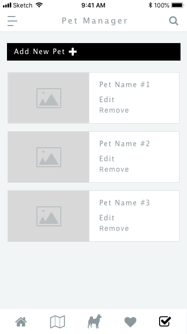
As we continued the research and expanded the possibilities of our pet matching system, it became evident that our design would have to serve two sides of the process: adopters and shelters (in this case, shelters represent any and all types of pet rescues). Thus, in our current iteration, once an adopter has discovered a potential pet, they can take more seamless action to connect with the shelter caring for them. Conversely, the shelter should be supported with information on an adopter’s lifestyle and capability to care for a pet, enabling the shelter to better consult an adopter when initially approached. Because of this, our design supports an adopter-facing side and a shelter-facing side within the same system for optimal communication and reporting.

Flow chart of new experience. I’m really proud of this chart!
SHELTER SIDE
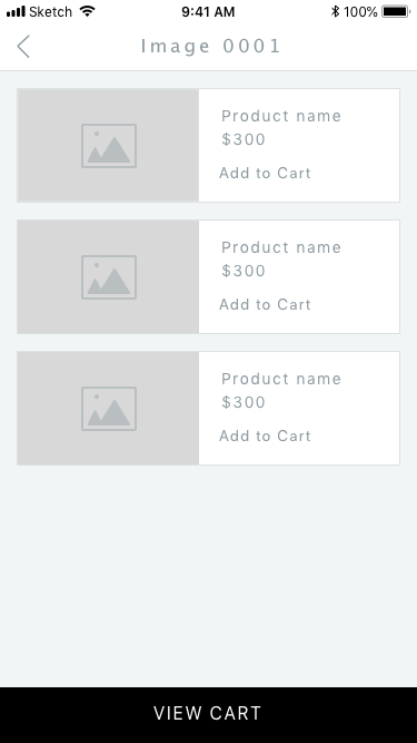
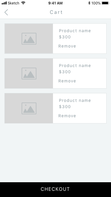
ADOPTER SIDE
User Testing - 2nd Round
Now that we had further fleshed out the design, especially with adding the shelter side of the application, we needed to test the success of it. I lead the user testing protocol and with the help of Komal, we made an in-depth testing plan that covered performance, efficiency, memorability, errors, and satisfaction. There was a SUS as an ending survey for the user testing. For the full view, check it out here. However, we had prototype limitations, and did not include every single task on the protocol. Instead we prioritized based on our prototype’s capabilities. Since we had two side of this application, we sought after the appropriate audience: animal shelter workers tested the shelter side and recent/potential adopters tested the adopter side. We also attempted user testing the questionnaire for the pet matching through reverse engineering (we provided a pet and background info, then told the participants to answer the quiz with that pet in mind); unfortunately the randomizer gave the same pet to 75% of the participants and we threw out the results.
We broke down the results into the following:
SHELTER, SUS score = 2.93/5
So what do you think of this prototype?
When posed this question, our participants responded in an overall positive manner. They mentioned that this system could be useful beneficial to their organization, and would help to eliminate some of their frustrations. We discussed some of the key issues the shelters face, and participants indicated that this would alleviate some of the tasks that rob them of valuable time. Participants did mention that they wished to make a more personal connection.
What were the parts you liked? Why?
Participants exhibited great interest in the prospect of making their process more efficient. They felt the design was user friendly, and they felt it would help to prevent duplicate or redundant activities.
What do you think about the parts you didn’t like? Why?
Participants expressed confusion when presented with the task functionality. Were the tasks for the individual or for the overall staff on the clock. While they felt this could be highly beneficial, they did mention that there would be some areas of tension with the application. For instance, shelters typically do not take appointments. The shelters operate on a first come, first serve basis. The matching and scheduling functionality would need to align to the shelters’ operational process.
Where did you feel most confident? Why?
Our participants indicated that our design was intuitive after some use. Participants commented that the “our animals” section was like systems they have used before making it easy to understand quickly. Other desirable features mentioned were the pending status, information, and layout of the application inbox.
Where did you feel most confused? Why?
The initial navigation was difficult to understand. As an observation during the exercise, it appeared our application language economy did not match that of the shelter’s existing economy. It would be important to match the language to a users’ expectations. Due to the navigational and language, participants noted that there was a learning curve when using this system.
Any additional comments?
Participants were overwhelmingly positive about the notion of providing information to adopters to reduce shelter call volume. They remarked that “99%” of their call volume consisted of questions addressed by our design. Participants also recommended that other animal matches to be shown to owner as well as to not limit the potential adopter to only 1-3 pets. Lastly, the participants responded positively to the look and feel of the system.
ADOPTER, SUS score = 2.85/5
So what do you think of this prototype?
By posing this question we learned about several aspects of the design. After distilling our findings from this question amongst each of our participants, it became evident that we accomplished the goal of providing more educational content for adopters to reference before adopting a pet. In addition, participants indicated that the information provided about the shelters proved very helpful and helped addressed the previously expressed concerns about shelter requirement confusion.
We also received feedback about some of the areas that could be improved and that caused some confusion. For instance, some of the layout and design choices presented some minor confusion with our participants.
What were the parts you liked? Why?
Our participants responded positively to the vast amount of information we included in our design. Participants appreciated seeing the detailed and meaningful information as well as the attributes for each pet. In addition, displaying shelter requirements and other shelter information was highly important to our test participants. Our participants also noted that the design was easy to use.
What do you think about the parts you didn’t like? Why?
As we heard briefly from the feedback in our first question about the overall design, we noticed here again that users were presented with confusion particularly regarding the navigation elements and tab labeling. We did receive feedback regarding some of the quiz questions. Some of the questions presented some confusion as some responses were not mutually exclusive. In addition, some questions would have been difficult to answer without more context and detail. The specific question that posed caused some of the confusion was the financial readiness question.
Where did you feel most confident? Why?
When presented with this question, our users confirmed once again that the level of detail in the information provided was appreciated. We also received some positive feedback regarding the quiz questions. The quiz was described here as straightforward.
Where did you feel most confused? Why?
Participants expressed confusion regarding the lack of a clear home page or dashboard. In addition, participants took the opportunity to again provide feedback regarding the issues with the navigation element confusion. The perceived navigation functionality was found to be confusing to some of the participants. In addition, it was clear that the resources section caused confusion with our users. Once our users navigated to the resources tab, they noted that the information there was confusing. It was unclear what the resources tab was for specifically. Participants also commented that “favorites” and “pending applications” appeared separate from the search results and that they did not appear to live at the same level of navigation even though they were they were next to each other.
Any additional comments?
Participants expressed the need to view pet attributes easily and quickly. It was mentioned that they would like to see gender and age before drilling down into the pet profile. In general, participants expressed interest in seeing attributes such as: name, breed, age, gender distance, shelter (listed in order of importance).
Next Steps & Reflection
It was clear that the size of this project became too large by the end of the semester, so some features weren’t developed as well as they could have been. If this project were continued, the features would be more fleshed out in the prototype and then all of the tasks in the testing protocol could be implemented. However, before doing that, more interviews would be needed to gain specific knowledge from the shelter side of the adoption process. The next iteration will handle content organization and navigation as a priority for the adopter side, as to cut down on some of the confusion that occurred. Additionally, the color scheme would be adjusted, as the comments of the colors being too intense and cluttering the screen were too apparent to ignore.
In the course of testing our designs, we learned a great deal about our process along the way. When we began testing, we immediately became very conscious of problems that arose with the prototype itself. During the first test of the adopter’s prototype, we quickly learned that the prototype was very linear and testers did not have much flexibility to explore the application. The original objective was to keep the prototype lean so that we did not over invest time creating unnecessary screens or linking every button. However, this lean thinking hindered us as once users realized that few of the buttons were actually linked, they became less likely to click around and search for the solution to their assigned task. Additionally, a task was assigned to a participant, they would often click on secondary links rather than the primary paths that we had erroneously assumed they would use. This caused confusion particularly because we requested that our users alert us when they believed they had achieved the task. They were not incorrect, but we inadvertently made them believe they were. In the future, we would need to set aside more time to “playtest” our prototype and preclude surprises before testing began.
One thing that was difficult about this process was trying to determine which errors were true errors that needed to be updated to be tested, and which mistakes should remain in order to maintain a consistent testing experience. When we received feedback from participants, we became inspired to add new pages, features, and categories, but we reluctantly chose to waiting until after the tests are conducted and synthesized so as to not compromise the validity of our study.